02 June 2013
The New Google Maps User Experience
Google had its latest Google IO in May this year. My favorite announcement was definitely the update to Google Maps. The new Maps was announced in the main presentation and you can watch it here. There have been a lot of changes but I want to focus on the third point, which was how “the Map is the UI.”
Disclaimer: I am not a user interface/user experience expert by any means. I am just a very enthusiastic user that loves things that work well. All of this is anecdotal.
The Past
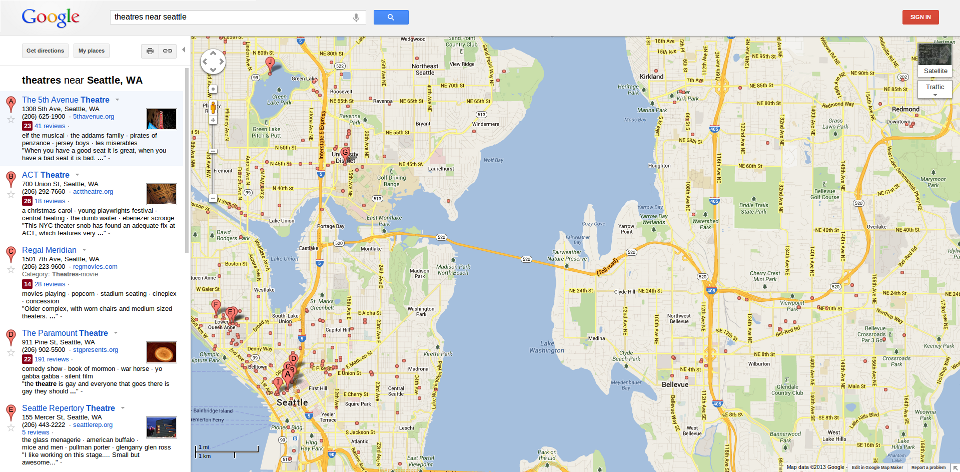
I think most of us are familiar with the past UX (user experience) and UI (user interface) on the old Google Maps. The top 10 search results show up on the left, and then the map with those markers are on the right:
It worked pretty well and most of us got very accustomed to navigating the UI and getting the information we needed.
Initial Reaction
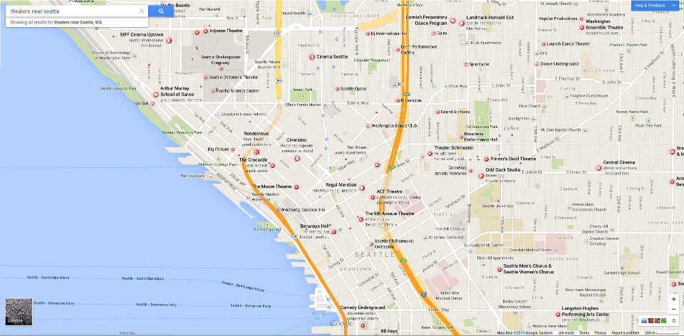
When I first heard about the UI overhaul for the new Google Maps, I was pretty excited. I saw that it was finally using the complete window to show the whole map and the white search results was gone. I signed up to preview the new interface almost immediately and received access a few weeks ago.
Reaction After Using It
I was pretty let down after I first tried it. I (mistakenly) didn’t do the tour and assumed that I would be able to figure it out and that it would be intuitive.
I was a little confused as to where all of the search results were. I was expecting a floating window on the left that had a list of everything that showed up. I also couldn’t find how to access Street View and kept looking for the friendly little Yellow guy to drag around.
This sort of initial puzzlement can be expected when a UI completely changes. I usually have an easy time adapting yet I was having issues with the new Google Maps. I decided that I should do what I initially skipped and do a tour by clicking the Help in the top right.
Forgetting the Old Google Maps
The tour is incredibly simple. It shows that the new search results intuitively show up on the map. Street View can be started by either just clicking on the street or clicking on a search result.
I was very intrigued by all of this. The new Google Maps is incredibly intuitive yet I had a problem adjusting to it from the old. I had to force myself to forget the old ways of Google Maps in order to make full use of the new UX.
An Interesting Problem
Whenever I hear about people creating UIs, they always try to think about what is the most intuitive and simplest for the user. Yet I hardly ever hear them mention how the user might expect the new UI to operate based on their past experiences and preconceived notions.
This may seem like a trivial issue because if the UI is intuitive enough, the user should just know how to use it. Yet in my case with the new Google Maps, I expected that I’d be able to figure out how to use the new UI. I wouldn’t even consider myself a below average user. I rarely have an issue using new UIs.
Takeaway
With the new Google Maps, it was very easy for Google to add a tour to show how to use the new feature. Yet I doubt that will be utilized by a lot of the users. Being told how to use something is the last thing a user wants.
This whole situation added a new perspective to how I will approach UI/UX issues in the future. Sometimes the most intuitive and easiest way to interact with something might still present issues because of the user’s past experiences and knowledge.

